The other day I was taking my little doggie for a walk and was feeling pretty lucky for the life I get to live every day. My mind started to wander back to when I first came up with the concept for “The Pod Photography” in 2006 and how the brand has evolved since then. I also remembered something I haven’t thought about in years: how I came up with the logo!
Let me backtrack just a tiny bit before getting to the logo and talk about the name. The name “The Pod” kinda just came to me one day and I thought it was such a perfect name for a portrait studio. Babies are little growing “peas,” we use tripods when we shoot, when you are pregnant there’s a little “pea” inside you etc. The name was catchy and easy to remember, too. Then, a couple of years after I copy-wrote the name, iPods came out. At first I was so upset that my awesome name has been “stolen.” But I soon realized that due to the mega craze for iPods, people regularly heard the word “pod” and now everyone thought that they had heard of us. Back in 2008 when I had a tiny little studio in a sketchy neighborhood and no employees – I would say to people “oh, yes – my studio is called The Pod Photography” and people would say “yes, I’ve heard of you guys! Can I hire you to take my baby’s photos?” The indirect brand association certainly didn’t send people flooding to the studio, but it didn’t hurt either! Since then, the name has stuck and we’ve branded “PodMoms” and other Pod related catch phrases that have become pretty popular in our little community.
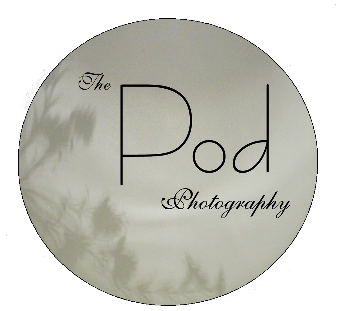
On to the logo! So, when I was on the earlier mentioned walk I remembered how I came up with the logo. I remember that I had been agonizing for weeks, sketching out different versions and trying to come up with a cool logo for The Pod. I wanted the logo to have an organic vibe to play up the “Pod” but didn’t want to go so obvious as to actually have a pea pod as part of my logo. Then, one day I was laying in bed and I saw it. Not in my mind’s eye, but projected onto my ceiling. On my nightstand was a lamp that projected a circle of light onto the ceiling when it was turned on, and I had a vase with flowers in it on the same nightstand. The flowers were in the path of the light and so their silhouette was cast onto the edge of the circle of light. There it was, my logo!
This is The Pod logo from 2006. I literally took a photograph of my ceiling with the flowers arranged just right for the logo. I was obsessed with gray-green as a color – since the very first set of plates I ever bought myself as an adult were a gray green color – and so I put a gray-green tint onto the design.
Logo 2008
In 2008 I realized that my homemade logo wasn’t going to cut it and so I designed a more graphic one myself. At least this shade of green doesn’t look quite as spooky!
In 2009 I hired a website designer to create an all Flash website (that was all the rage at the time!) and for some reason I wanted the background of the website to be pink. I had this vision of it looking like glitter and – being the old-school photographer that I am – instead of playing around in Photoshop to create that – I found a sparkly parking lot with that rocky asphalt and waited until the light was perfectly playing up the light and took a picture of it. That photo was the background to my website for years! However, a green logo does not look good against pink and so the color “Pod Blue” was born. We talk about that shade regularly at the Pod when we design new promotional pieces, paint the studio and do other things – it is a very specific and particular shade that we are very proud to call ours. That’s my business card above, with the information to my second studio and the pink background from my website. You have to admit that the background looks pretty cool!
Then in 2011 business was really picking up and we finally had a few dollars to spare and hire a logo designer. I selected this holiday card designer gal whose work I really admired. She didn’t really do logos but I loved her overall style so much that I took a chance and asked if she’d take on the project. Fast forward about 2 months when she was no longer replying to my emails because I’d annoyed her with so many super specific details (like exact leaf positions and moving the letters over 5 pixels!) I finally had my new logo! I wanted a mix of modern and vintage with a little organic thrown in and she definitely delivered.
We have loved our logo since then – however 2015 has been a year of changing The Pod’s style. We are moving away from vintage towards clean, crisp, modern, fresh and so I asked Natalie, our designer, to give our logo a little face lift this year. She didn’t alter too much, but the font and removing the background damask does give it a more modern feel.
I hope that you have enjoyed going down memory lane with me and watching the evolution of our brand. I am beyond thankful that I have been able to dedicate the past nine years of my life to this company and all the thousands of people I have had the privilege of photographing. Thank you!
Best,
-Erika

