

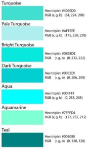
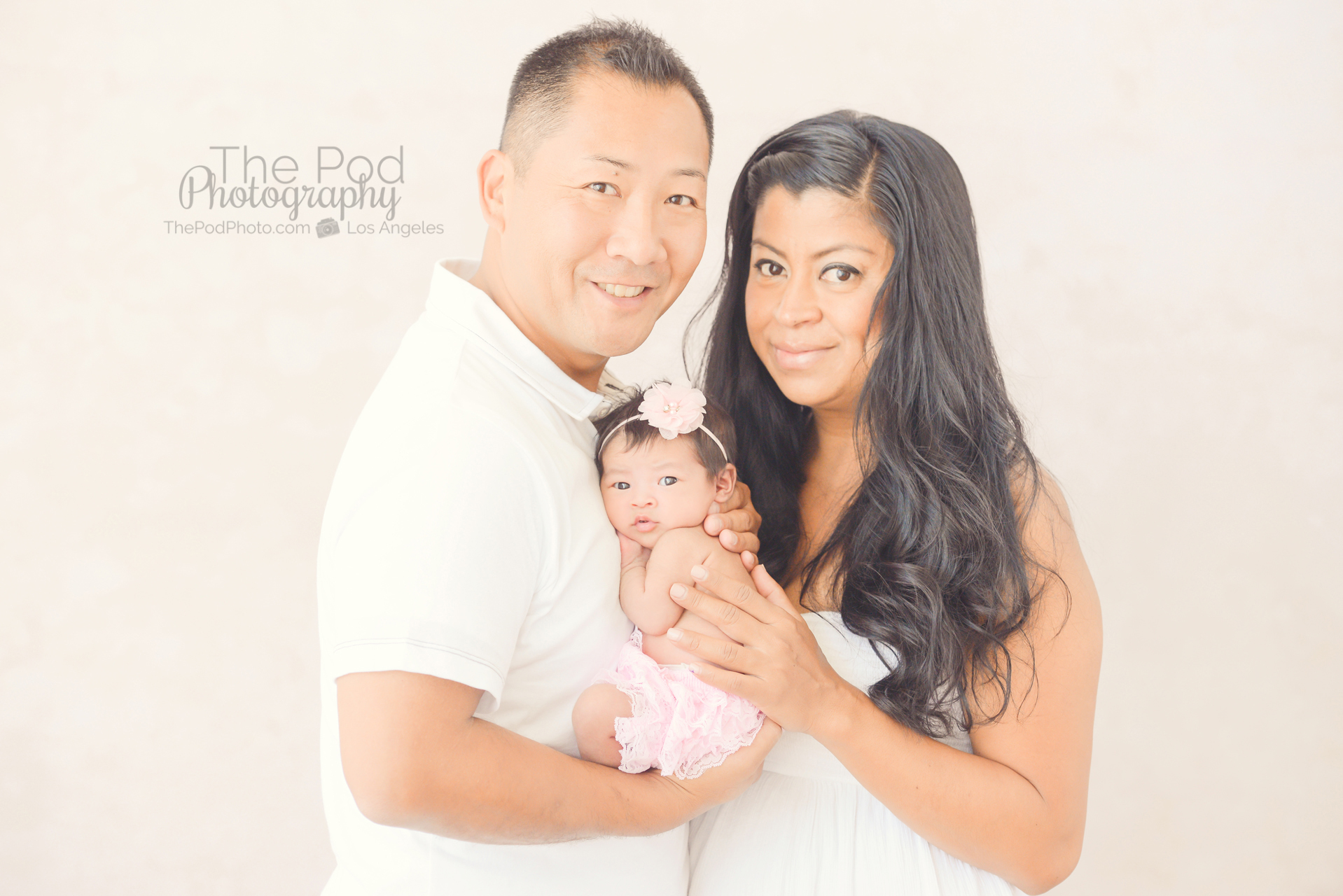
Sometimes it feels like the parents of little girls who hire us for their baby’s newborn pictures want the same color scheme, mainly involving pink. Pink is lovely, it’s cute, it’s timeless, it’s sweet and it generally matches the decor in the baby’s nursery. However, we have so many amazing turquoise, purple, mint, burn orange and other fabrics at our studio that I am just itching to use! Therefore, when these new parents said that they really like pink for their daughter’s newborn pictures, but would like me to please add a little purple and teal in there as well. Yesss!!
There’s only one trick: what shade of turquoise do they like? The word turquoise encompasses a variety of shades – ranging from a super light aqua, to a little greenish mint, to the bold darker toned true teal. I recently had to ask the shade that someone was thinking of, and thought that defining these tones would be helpful.
Here’s the turquoise color scale:
 I originally thought that a shade of mint would be included in the turquoise family – but I suppose it is in the green family, plus everyone pretty-much knows what mint looks like and there is little room for interpretation.
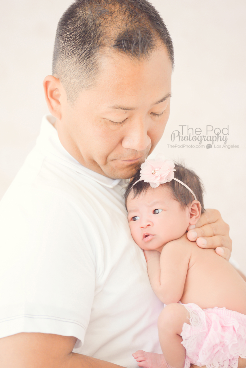
With this little lady we did two turquoise inspired photo sets – for the first I selected a very soft, Pale Turquoise for this little girl’s bucket pictures – and we had the perfect girly bow headband and matching colored fabrics. Secondly, we had a beautiful bright Turquoise lace swaddle fabric that we used when this baby girl was wide awake and needed to be tucked in tight so that she would fall back asleep.
Check out the rest of this newborn photo session that we captured at our Hermosa Beach adjacent photography studio.


Interested in finding out more about our professional baby photo shoots? Take a look at our website www.ThePodPhoto.com and give us a call at 310-391-4500 to start planning your baby’s pictures!


