
Looking for the best family photos?
Your search has stopped right here, and your future of amazing portraits has begun! As professional family photographers, we pride ourselves in delivering only our very best to each and every client that we see. Whether you live close to our studio, or are making the trek out from further away (like many of our Pasadena clients), our number one priority is YOU!
How to dress for your family photos
There are so many options! Many DOs and many DON’Ts! Here are some of our go-to tips for how to dress for your family photos:
DO coordinate, DON’T match
The days of everyone wearing the same cheesy white t-shirt and jeans are over. So rather than going “matchy-matchy,” try coordinating by choosing the same color family. Think warm tones, cool tones, pastels, and color themes. Some examples include
- Blues, aquas, mint greens – with neutral tones like beige, cream, gray and white
- Pinks, peaches, corals, soft feminine colors – again, combined with neutral tones to balance to the color. Do not mix in hot pink with soft pastel coral tones.
- Pastels. When you stay in the same TONE of color, you can actually mix warm colors (orange, coral, yellow) with cool colors (blue, mint, lavender). As long as they are all soft colors versus any neon or “hot” colors, you are good!
- Keep it neutral. Maybe color isn’t your thing. No problem. Have everyone stick to grays, whites, creams, etc.
Avoid harsh contrasting colors
Do not have one person in black and another person in white. It messes with the eyes and pulls attention away from what you really want to look at in your family photos
Avoid patterned prints
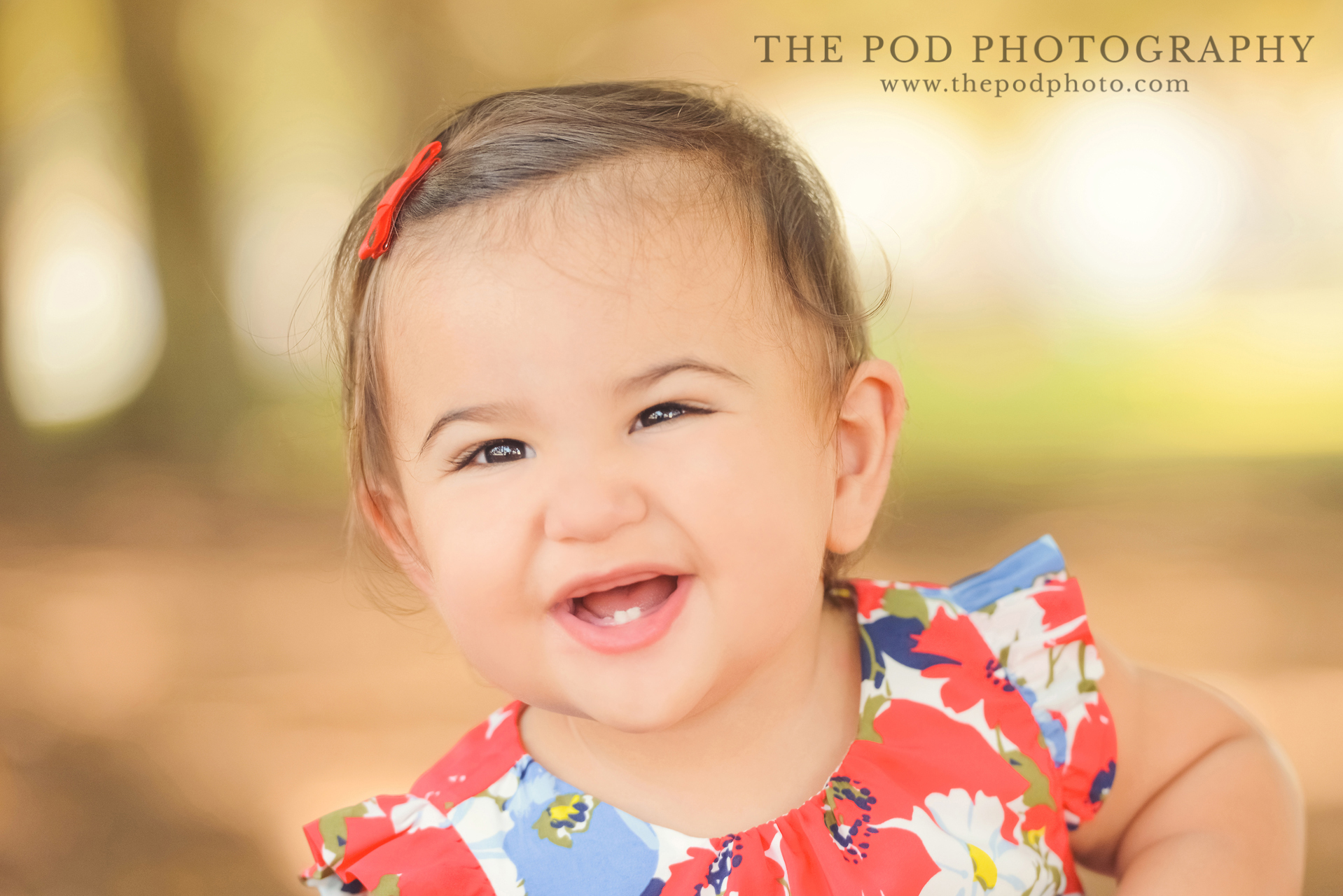
Bold patterns can also pull your attention away from the point of focus. Bold checkers, plaid, stripes and polka dots are a huge no-no for family photos. Sometimes, pattern CAN work, though. Floral pattern on a little girl’s dress, or maybe even for mom, can sometimes work well. Plaid can also SOMETIMES work. The point with pattern is: is there is going to be pattern, only have ONE person wearing pattern. Otherwise, it can clash and look really “busy” in photos. Our suggestion? Have the kids be in pattern if anyone.
Texture is good!
Distinct from pattern, texture is a whole different world! We LOVE seeing lace detail or a crochet part of a dress. Texture adds some visual interest without pulling attention away from the image. Think Anthropologie or Free People for women’s clothing! Some of our favorites 🙂
Classic or trendy?
Think ahead to how you are going to look back at these images. Do you want to look at them and be appalled by some awful fashion fad that was super cool at the time but now just looks ridiculous? We have found that most people like to keep it classic and timeless. But if you are thinking of incorporating something trendy, don’t be afraid to ask your photographer – because it may just work!
Think artwork!
Where do you plan on hanging these photos in your home? Pull in colors from that room so that your family photos are a piece of artwork, custom-made for that particular room! So if you have a lot of green in your living room for example, let’s not wear red in our family photos. Unless of course, you want it to look like Christmas all the time in there!
Themes
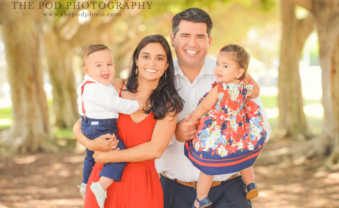
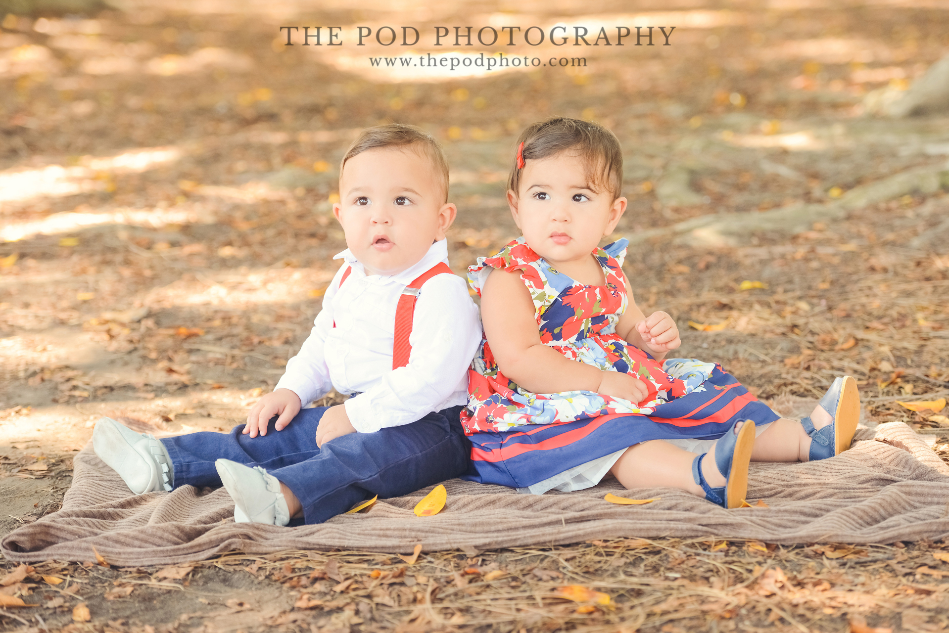
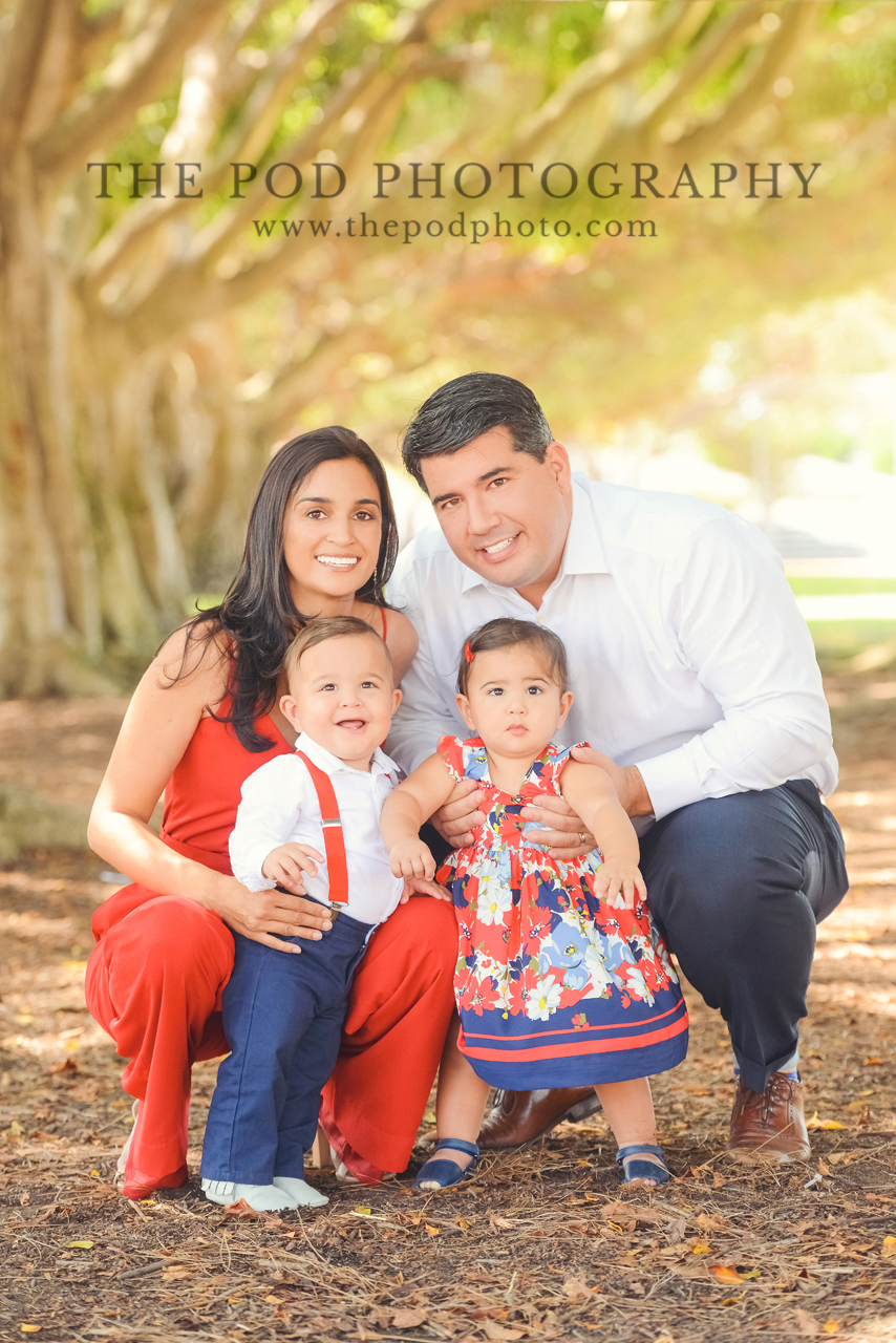
Depending on what you are taking these photos for, you can also play up a theme. If it’s for your daughter’s princess birthday party, don’t be afraid to wear pinks and golds! Your son’s camping theme party? Earth tones, rustic colors! Or maybe it’s for your nautical themed room and there are lots of reds, whites and blues! And in celebration of today’s holiday, those are the images we wanted to share with you today:


Give us a call at our Pasadena family photos studio at 310-391-4500 to set up a consultation with your Pasadena photographer. Be sure to follow us on our Blog, Facebook, Instagram and Google+ to see what we’ve been up to, or explore our YouTube page for more!